Solved Examples and Worksheet for Using Graphs to represent Proportional Relationships
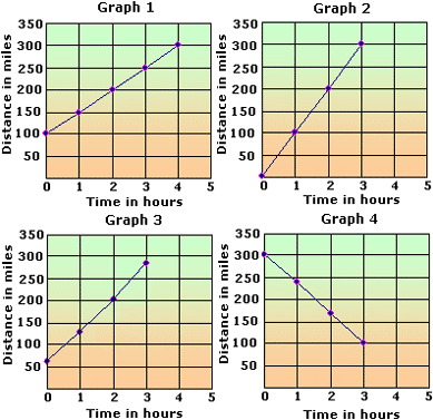
A. Graph 1
B. Graph 2
C. Graph 3
D. Graph 4
Step: 1
[Original equation.]
Step: 2
[Substitute 0 for t
Step: 3
= 0
[Simplify.]
Step: 4
[Substitute 1 for t
Step: 5
= 100
[Simplify.]
Step: 6
[Substitute 2 for t
Step: 7
= 200
[Simplify.]
Step: 8
[Substitute 3 for t
Step: 9
= 300
[Simplify.]
Step: 10
Represent the above data in tabular form, as shown below.


Step: 11
Among the choices, graph-2 suits the result.
Correct Answer is : Graph 2
A. 40
B. 44
C. 48
D. 43
Step: 1
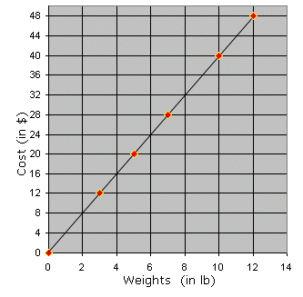
In the graph, x-axis represents Weights of apples and y-axis represents the cost of apples.
Step: 2
From, the graph the cost of 12 lbs apples is $ 48.
Step: 3
So, James has to pay $ 48 for 12 lbs of apples.
Correct Answer is : 48
A. Graph 3
B. Graph 2
C. Graph 4
D. Graph 1
Step: 1
Cost of a pair of jeans = $8
Step: 2
Cost of n pairs of Jeans= $8× n
Step: 3
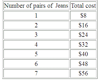
The following table shows the total cost for the corresponding number of pairs of Jeans.

Step: 4
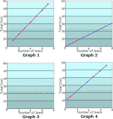
The points plotted in Graph 1 are same as the values obtained in the table.
Step: 5
Graph 1 shows the relationship between the number of pairs of Jeans and the total cost.
Correct Answer is : Graph 1
A. Graph 4
B. Graph 2
C. Graph 1
D. Graph 3
Step: 1
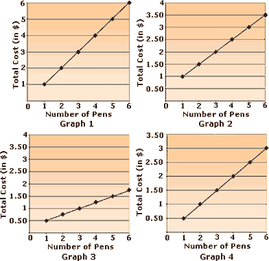
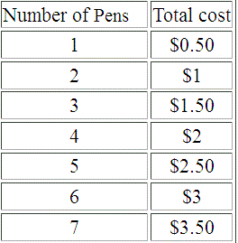
Cost of a Pen= $0.50
Step: 2
Cost of n
Step: 3
The following table shows the total cost for the corresponding number of Pens.

Step: 4
The points plotted in Graph 4 are same as the values obtained in the table.
Step: 5
Graph 4 shows the relationship between the number of pens and the total cost.
Correct Answer is : Graph 4
A. Graph 4
B. Graph 3
C. Graph 1
D. Graph 2
Step: 1
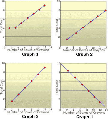
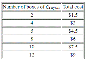
Cost of 2 boxes of Crayons = $1.5
Step: 2
The following table shows the total cost for the corresponding number of boxes of Crayons.

Step: 3
The points plotted in Graph 3 are same as the values obtained in the table.
Step: 4
Graph 3 shows the relationship between the number of boxes of crayons and the total cost.
Correct Answer is : Graph 3
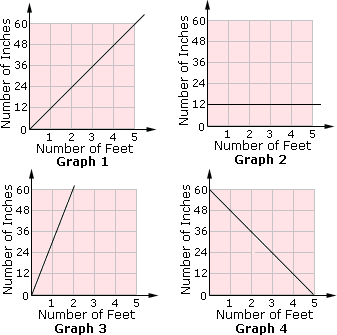
A. Graph 4
B. Graph 2
C. Graph 3
D. Graph 1
Step: 1
1 foot = 12 inches
Step: 2
Make a table of values for this relation.


Step: 3
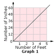
Plot the values on a coordinate plane and join the points.
Step: 4
The graph looks like the one below.

Step: 5
So, Graph 1 shows the relation between the number of feet and the number of inches.
Correct Answer is : Graph 1
A. Graph 2
B. Graph 4
C. Graph 1
D. Graph 3
Step: 1
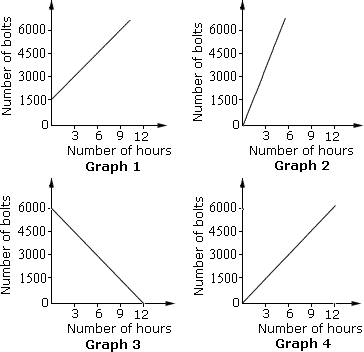
The number of bolts produced by the machine in 1 hour = 1500 3
Step: 2
As the time goes on, the total number of bolts produced by the machine, increases.
Step: 3
The direct variation between the number of bolts produced by the machine and the time taken can be given as, number of bolts produced in x x
Step: 4
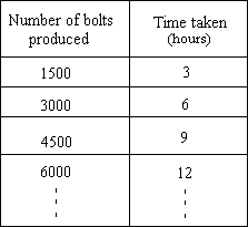
The number of bolts produced and the time taken is shown in the table.

Step: 5
Graph 4 shows the relationship between the number of bolts produced by the machine and time taken.
Correct Answer is : Graph 4
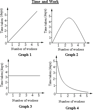
A. Graph 1
B. Graph 3
C. Graph 2
D. Graph 4
Step: 1
As the number of workers increase, the time taken by them to finish the job decreases.
Step: 2
Inverse variation is a relationship between two variables, in which, the product is a constant. When one variable increases the other decreases in proportion, so that the product is unchanged.
Step: 3
Therefore, Graph 4 shows the relation between the number of workers and the time taken by them to finish a particular job.
Correct Answer is : Graph 4
A. $6
B. $4
C. $3
D. $5
Step: 1
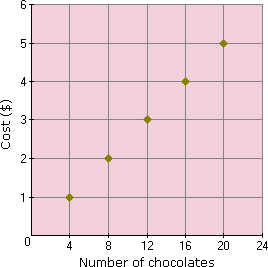
In the graph, the x y
Step: 2
From the graph, cost of 16 chocolates is $4.
Step: 3
So, Laura has to pay $4 to buy 16 chocolates.
Correct Answer is : $4
A. 240 words
B. 180 words
C. 150 words
D. 210 words
Step: 1
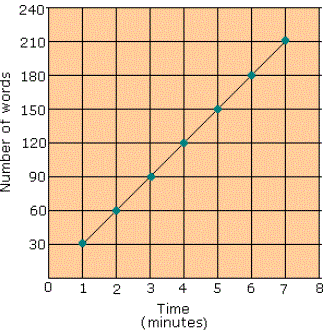
In the graph, the x y
Step: 2
From the graph, the number of words typed in 7 minutes is 210.
Step: 3
So, Jim typed 210 words in 7 minutes.
Correct Answer is : 210 words
A. Graph 1
B. Graph 2
C. Graph 3
D. Graph 4
Step: 1
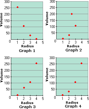
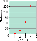
Volume of a sphere V = 4 3 π r 3
Step: 2
Make a table of values for the volume V = 4 3 π r 3
| V | ( | ||
| 1 | 4 | (1, 4) | |
| 2 | 32 | (2, 32) | |
| 3 | 108 | (3, 108) | |
| 4 | 256 | (4, 256) |
Step: 3
Graph the ordered pairs as shown.

Step: 4
Graph 4 matches the above graph.
Step: 5
So, Graph 4 best represents for the volume of a sphere with radius r
Correct Answer is : Graph 4
A. Graph 4
B. Graph 2
C. Graph 3
D. Graph 1
Step: 1
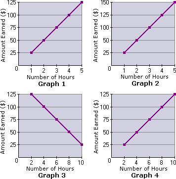
Let a t
Step: 2
[Original equation.]
Step: 3
At t a
Step: 4
At t a
Step: 5
At t a
Step: 6
At t a
Step: 7
At t a
Step: 8
Represent the above data in tabular form, as shown below.
| Input ( | 1 | 2 | 3 | 4 | 5 |
| Output ( | 25 | 50 | 75 | 100 | 125 |
Step: 9
Among the choices, Graph 1 suits the result.
Correct Answer is : Graph 1
A. Graph 4
B. Graph 3
C. Graph 1
D. Graph 2
Step: 1
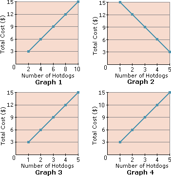
Let n c
Step: 2
[Original equation.]
Step: 3
At n c
Step: 4
At n c
Step: 5
At n c
Step: 6
At n c
Step: 7
At n c
Step: 8
Represent the above data in tabular form, as shown below.
| Input ( | 1 | 2 | 3 | 4 | 5 |
| Output ( | 3 | 6 | 9 | 12 | 15 |
Step: 9
Among the choices, Graph 3 suits the result.
Correct Answer is : Graph 3
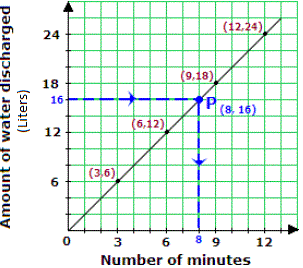
A. 18 minutes
B. 32 minutes
C. 8 minutes
D. 16 minutes
Step: 1
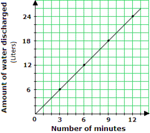
Locate 16 on the vertical axis. Follow the horizontal line through 16 till the line meets the graph at P (say). From P take a vertical line to meet the horizontal axis. This meeting point gives the time it takes to discharge 16 liters of water i.e. 8 minutes..

Correct Answer is : 8 minutes
- Converting Numbers to Standard and Scientific Notation-Gr 8-Solved Examples
- Comparing and Ordering Numbers in Scientific Notation-Gr 8-Solved Examples
- Operations with Scientific Notations-Gr 8-Solved Examples
- Using Laws of Exponents-Gr 8-Solved Examples
- Representing Squares and Square Roots-Gr 8-Solved Examples
- Identifying Square and Cube Roots of a Numbers-Gr 8-Solved Examples
- Applying Proportional Relationships-Gr 8-Solved Examples
- Solving Linear Equations in One Variable-Gr 8-Solved Examples
- Solving Multi-Step Linear Equations Using Distributive Property-Gr 8-Solved Examples
- Solving Systems of Equations by Substitution Method-Gr 8-Solved Examples
- Solving Systems of Equations by Elimination Method-Gr 8-Solved Examples
- Solving Linear Systems Equations Graphically-Gr 8-Solved Examples
- Finding Number of Solutions of System of Linear Equations-Gr 8-Solved Examples
- Word Problems on Systems of Equations-Gr 8-Solved Examples
Related Worksheet
- Proportion