HISTOGRAM
Definition Of Histogram
A histogram is a bar graph that shows how frequently data occur within certain ranges or intervals. The height of each bar gives the frequency in the respective interval.
Examples of Histogram
Video Examples: Histogram
Solved Example on Histogram
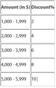
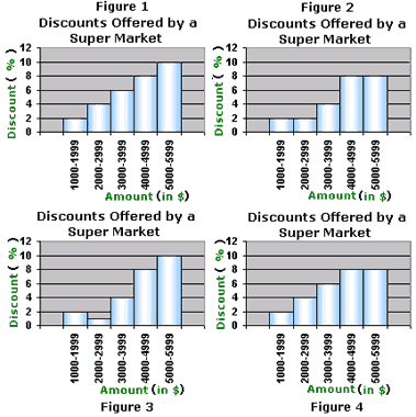
Ques: The discounts offered by a super market are as shown in the table. Which of these histograms is the correct representation of the data?
Choices:
A. Figure 1
B. Figure 2
C. Figure 3
D. Figure 4
Correct Answer: A
Solution:
Step 1: The heights of the bars in the histogram indicates the discount offered (in %) for the corresponding amount (in $)
Step 2: Observe the graphs to match the heights of the bars in each graph with the values in the table.
Step 3: It can be observed that the heights of the bars in Figure 1 matches with the values in the table.
Step 4: So, Figure 1 is the correct representation of the data.
Quick Summary
- Visual representation of data distribution
- Shows frequency of data within intervals
- Bars represent intervals, height represents frequency
🍎 Teacher Insights
Use real-world examples to illustrate the use of histograms. Emphasize the importance of choosing appropriate bin sizes to reveal patterns in the data.🎓 Prerequisites
- Basic Arithmetic
- Data Interpretation
- Bar Graphs
Check Your Knowledge
Q1: Which of the following is displayed on a histogram's vertical axis?
Q2: What type of data is best represented with a histogram?
Frequently Asked Questions
Q: What is the difference between a histogram and a bar graph?
A: Histograms display the distribution of continuous data over intervals, while bar graphs compare distinct categories.
Q: How do I choose the right bin size for a histogram?
A: The bin size affects the appearance of the histogram. Too small bins can create a jagged histogram, while too large bins can hide important patterns. Experiment with different sizes.