CIRCLE GRAPH
Definition Of Circle Graph
A Circle Graph is a graph in the form of a circle that is divided into sectors, with each sector representing a part of a set of data.
Example of Circle Graph
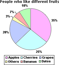
In the example shown below, the circle graph shows the percentages of people who like different fruits. Each sector in the circle graph represents a separate percentage of people that like the respective fruit.
Video Examples: Circle Graphs
Solved Example onCircle Graph
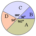
Ques: Find out the angle covered by A, B, and C in the circle graph.
Choices:
A. 306°
B. 162°
C. 36°
D. 108°
Correct Answer: A
Solution:
Step 1: Angle covered by A, B, and C is 108° + 162° + 36° = 306°.
Quick Summary
- Circle graphs represent proportions.
- Each sector corresponds to a part of the whole.
- The entire circle represents 100% of the data.
🍎 Teacher Insights
Use real-world examples to illustrate circle graphs, such as favorite foods or class demographics. Emphasize the connection between fractions, percentages, and angles.🎓 Prerequisites
- Fractions
- Percentages
- Angles
- Basic Arithmetic
Check Your Knowledge
Q1: If a sector in a circle graph represents 25% of the data, what is the angle of the sector?
Q2: In a circle graph representing favorite colors, if the 'Blue' sector is 50%, the 'Red' sector is 25%, and the 'Green' sector is 25%, which color is the most popular?
Frequently Asked Questions
Q: How do I calculate the angle of a sector?
A: Multiply the percentage of the sector by 360 degrees.
Q: What is another name for a circle graph?
A: It's also known as a pie chart.